
IV. Web Page Effect
1. Web Page Corner.
Lets curve the corner
Example :
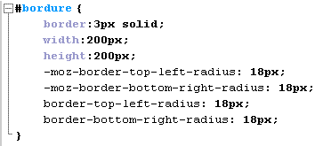
Explication :
Here, the «border-top-left-radius» and «border-bottom-right-radius» tag curve all the web page corner specify. If we only put one «border-radius» all the corner will be curve. The «width» and «height» specify the height and weight of your box.
2. The Box
a. Shadow
A lot Of tag can create several effect on a web site. Here, we gonna talk about Shadow.
Example :
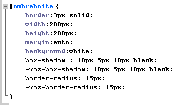
Explication :
The first number allow you to regulate the Shadow horizontaly, here only 1px by the right.
The second allow to regulate verticaly, here 6px at the bottom.
the third, allow you to Vagueness more or less your shadow by a number of pixel, here 4px.
the last one is about color.
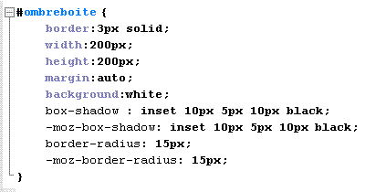
If you want to inverse the shadow, you only have to add the "inset" valor, With that, you can put your shadow to the top left .
Example :
b. Box Resize
Now we gonna create a box that you can modify height and width, you have to parameter your box size.
Example :
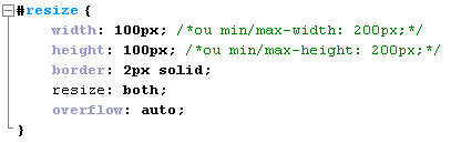
Explication :
You can add «min-» or «max-» before if you want a maximum or minimum size.
You can resize it with «resize» and «overflow» automatically resize it for you
You can Pull the right right bottom corner of your box in order to modify it.
c. Degrade
Put some color in your Magic Box! !!
You are now able to put some color in your web site
Example :
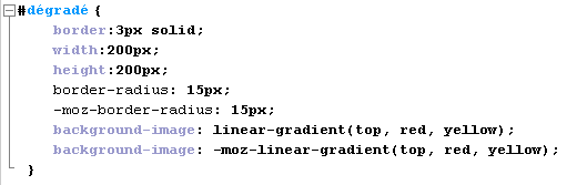
Explication :
«border-radius» will help you, let see a wonderfull sun rising.
Be carefull, Safari and Chrome, have some difference:
background-image: -webkit-gradient(linear,left top,left bottom,color-stop(0, blue),color-stop(1, yellow));
d. Contour
You can put border with the ouline tags
There are :
«inherit»
«dotted»
«solid»
«dashed»
«outset»
«ridge»
«double»
«inset»
«groove»
Look at this source Code
Example :

Explication :
«outline»:Define the Thickness of the choosen border,
the border with «dotted», and his color «#eb63eb».
«outline-offset»: The distance between the border and the outline, here 10px.
e. Transformation.
This tag allows you to rotate, tilt, zoom your box as narrow as you wish, with effects like zoom styles.
Example :
Explication :
«scale»: You can enlarge as shrinking the box. It varies between 0.1 and 2.
«rotate»: Allow you to rotate the box. Here she turns 60 degrees .
«translate»: allows to move your box. In the example above, the box moves to the right of 36px, 15px and then left.
«skew»: it allows you to change the shape of your box. Only the movement change of the top and bottom of the box, turning it into a more or less trapezoidal.
In the example below, your top box move to 6 degrees and the bottom left 8degress on the right.
Now you can build your website's dreams!! Your turn!


 1,
2,
3,
4,
5
1,
2,
3,
4,
5